Western Union:
My agency was hired by Western Union to revamp their outdated money transfer flow.
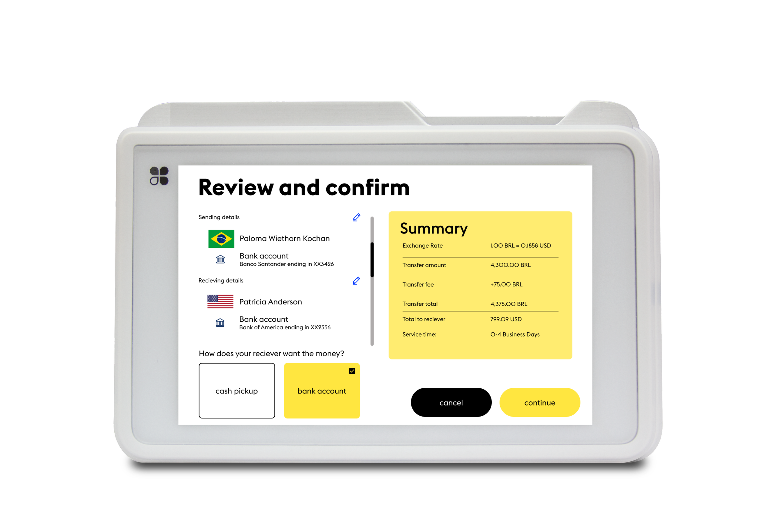
Our objective was to design a customer-led transfer through a Clover device and redesign the agent desktop experience in order to create a low friction experience for both customers and agents.
Western Union was seeking a more effective user flow for wiring money:
Allow users to go through a self-guided process
Reduce wait and time users took to initiate a transfer
Allow for the tellers to have a smoother transaction with customers
Make the experience for returning customers more seamless
the problem
The flow was entirely agent-facing and required multiple devices, enabling opportunities for miscommunication and device malfunctions. I visited Western Union storefronts, observing interactions between agents and customers to identify areas of friction where users were dropping off. I found that communication between agents and customers were long and taxing.
Our Findings
Agent centric - The agent leads the entire transaction.
Hardware malfunction and multiple device handling - More devices create more opportunity for errors that agents are ill-equipped to troubleshoot.
Data and transaction errors - It can be difficult for agents to transcribe information that customers give them verbally, particularly for non-native English speakers.
Long transaction duration - High manual data input and back-and-forth between agents and customers can cause lengthy interactions.
Transaction abandonment - At the end of a tedious transaction, a customer might still walk away after seeing hefty currency exchange rates and fees.
Proposed Ideal User Flow
Initially we mocked up an ideal user flow with the most efficient customer flow for three different flows: Express Check-out (new), Returning Customers, and New Customers.
Clover Screens
Throughout the Clover experience, I wanted to ensure that the user was given some visual indication whether they needed to take action or if there was an error in their transaction. I used yellow backgrounds for action oriented pages, black pages for error messages, white pages for telemarketing and fraud pages that had more text, and grey screens that are defaulted transaction screens for Clover devices.


